Renowned analytics academic Thomas H. Davenport predicted that “every company has big data in its future, and every company will eventually be in the data business.”
With 97% of organizations surveyed by New Vantage Partners currently investing in data initiatives, it’s clear the time has arrived. Yet still, only 47% indicated they’re competing on data and analytics, and only 19% believe they’ve successfully established a data culture. So despite all this investment, something’s clearly still missing.
“In a world of more data, the companies with more data-literate people are the ones that are going to win,” says Miro Kazakoff, senior lecturer at MIT Sloan. So how does an organization bridge this gap, developing the kind of data-literate people and organizational data culture needed to survive?
While there’s no quick or easy solution to this problem, it’s important to note that only 8% of the organizations surveyed believe that technology limitations are their main roadblock. The other 92% of executives point instead to culture as their greatest challenge in this arena.
It cannot be denied that adding data scientists and investing in DataOps can improve and accelerate the process of getting your data to where it needs to be, but don’t discount visual analytics and increased interactivity as a part of an organization-wide solution for moving your culture forward.
Does this mean every employee needs to have access to all of the data? Of course, that’s not typically safe, wise, or possible. But by implementing visual analytics with increased interactivity for relevant data, more employees can directly improve their own understanding and retention, by producing their own thoughts, within their workflow, as opposed to receiving prepared messages, such as only the kind that static dashboards or traditional reporting may present to them.
What’s the Role of Visualizations?
Visual analytics explore and analyze datasets visually, and their tools and techniques can aggregate data from disparate sources for output in data visualizations. This can mean giving separate areas of a workforce a classic dashboard, which can take a standalone form (and often static, for example as KPIs), to curate specific data points, all for a specific user’s consumption.
And we’ve all encountered crazily complicated infographics, which can be so loaded down by a list of required points to illustrate, they provoke headaches for users who can’t even figure out what it’s all meant to be showing in the first place.
While such interfaces have value by presenting data in graphic form, they can fail to achieve the kind of democratization organizations are increasingly seeking when used exclusively. It’s right there in the language: these show or present data with static indicators, and not, like the analog dashboards we traditionally use to operate machinery and vehicles, as active and connected measures.
Turns Out a Picture’s Worth a Whole Lot of Numbers, Too.
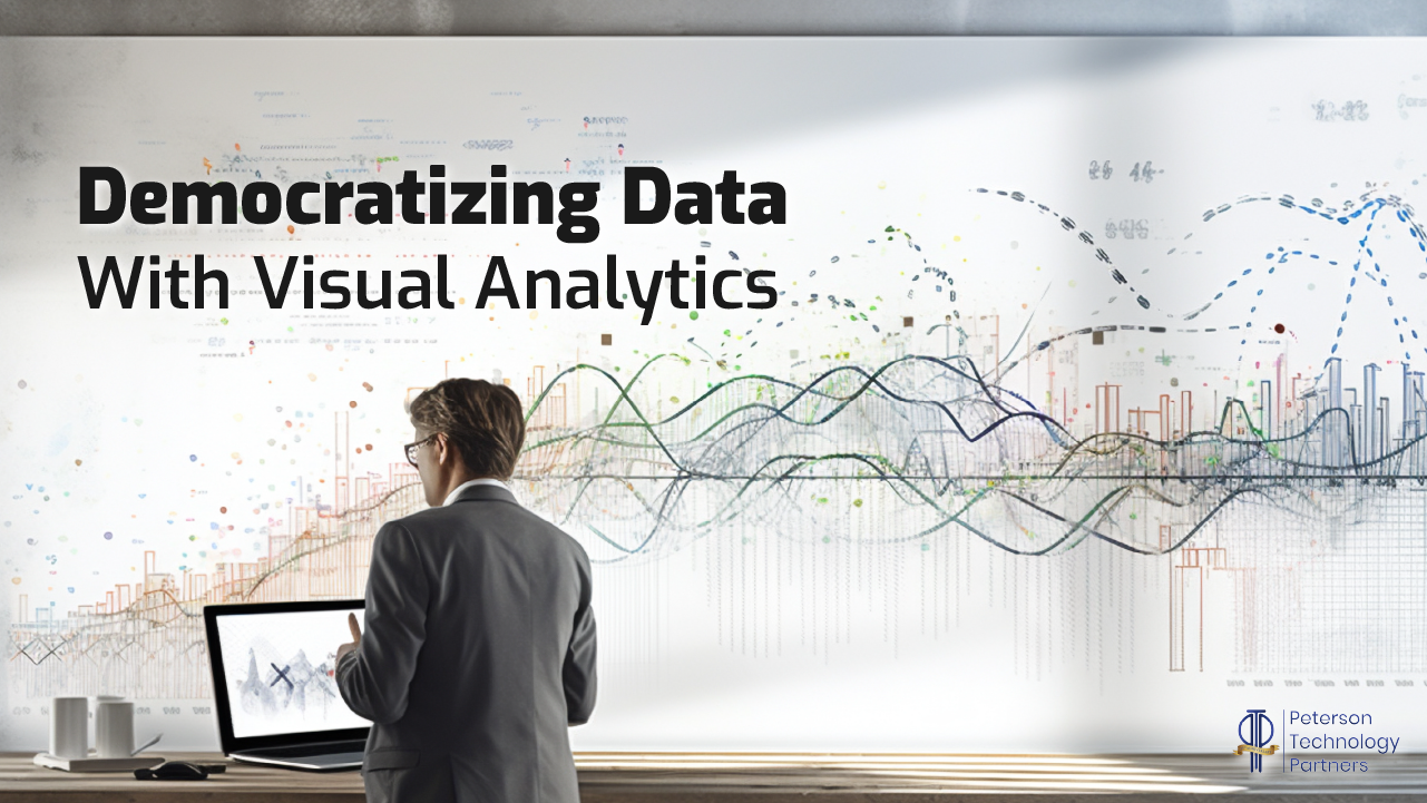
Used effectively, data visualizations of all kinds have a role in moving an organization to greater data literacy, by getting data concepts across to users faster, and more memorably, than by looking at numbers alone. They can be extremely effective at demonstrating outliers, clusters, and trends.
Most of the world became very familiar with COVID-19 maps in recent years, with their geographic concentrations, and expanding red dots. We’re all visual learners, as images are more likely to be retained in our minds, such as by the picture superiority effect. Astute use of graphics can emphasize or focus points being made in ways that are far harder to express with traditional reports or tables.
Check out these six great examples from the Harvard Business School.
But as more organizations are increasingly in the data business, these visualizations should, and must, do more.
Interaction Enables the Creator in Data Users.
Visual analytics can ease a move to greater democratization by fostering curiosity, giving users more power to manipulate data directly and study it for themselves.
The more team members can engage with data themselves, the more they move away from thinking like an end-consumer (reading static results as presented). When encouraged to be proactive, one must consider more fully the problems they face. This can also make clear where they need additional insights, beginning a cycle of communication that may currently be lacking, or restrained to narrow channels. An engaged user can give insight as to what data they may need that they don’t currently have. Rather than just being passive consumers of data, these team members thus become a part of the analysis process themselves.
Freedom to interact more substantially with an organization’s data poses obvious security risks, and can also lead to flawed conclusions, such as by taking correlation for causation. But these pains are worth working through, as 19th-century mathematician and “father of the computer” Charles Babbage said:
“The errors which arise from the absence of facts are far more numerous and more durable than those which result from unsound reasoning respecting true data.”
Conclusion
Organizations are increasingly in the data business, and data scientists are foundational in this aim, so it’s as great time as ever if you’re considering becoming one.
But to truly move culture forward, organizations must also leverage their visual analytics, and interactivity is an important step in getting people to think more for themselves about the challenges their organization faces.
Democratization increases when members of an organization don’t just read and accept messages passed to them, but instead work to create their own stories from the data, exploring problems and finding their solutions, first-hand.


